639056516
Sections
Welcome
We are Krankikom.
We encompass boldness and subtlety, exuberance and restraint, elaborate expression and simplicity, as well as vibrant color and timeless monochromes. Our diversity spans from the very core of our being to the tips of our toes and strands of our hair. Krankikom isn't merely an ordinary brand, nor just another elaborate design agency. Our essence thrives on diversity, and it's the essence we embody.
Outwardly, we stand as experts and professionals across an array of domains, ranging from development and frontend to design and project management. We're not content with merely offering a service; we aim to be collaborative partners our clients can trust, engaging with them as equals.
Through this Corporate Design Styleguide, our intent is to present a coherent and contemporary image that resonates with our essence both internally and externally. Our brand is a dynamic visual representation, not a static construct. Hence, we continually adapt this guide as needed, striving to maintain flexibility in the rules while nurturing the flow of creativity, all without compromising our distinctive identity.
Logo (Word/Figurative)
Two arrows became one.
Construction
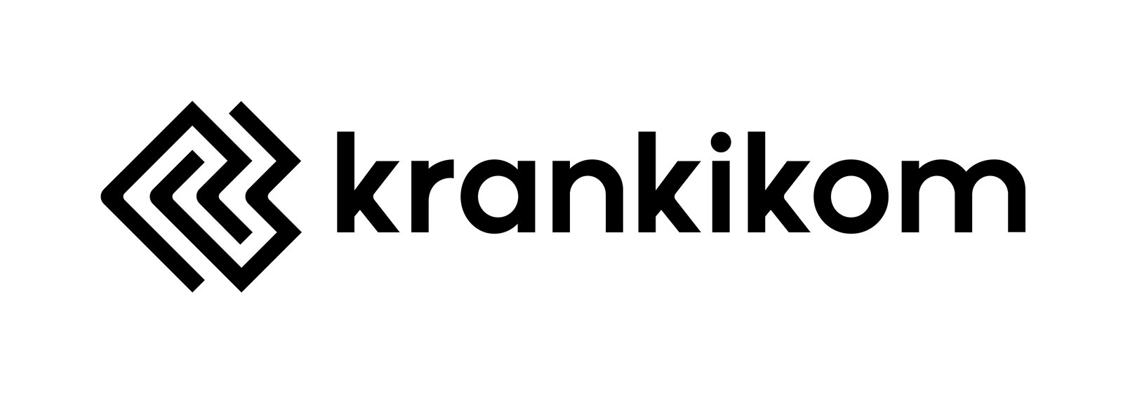
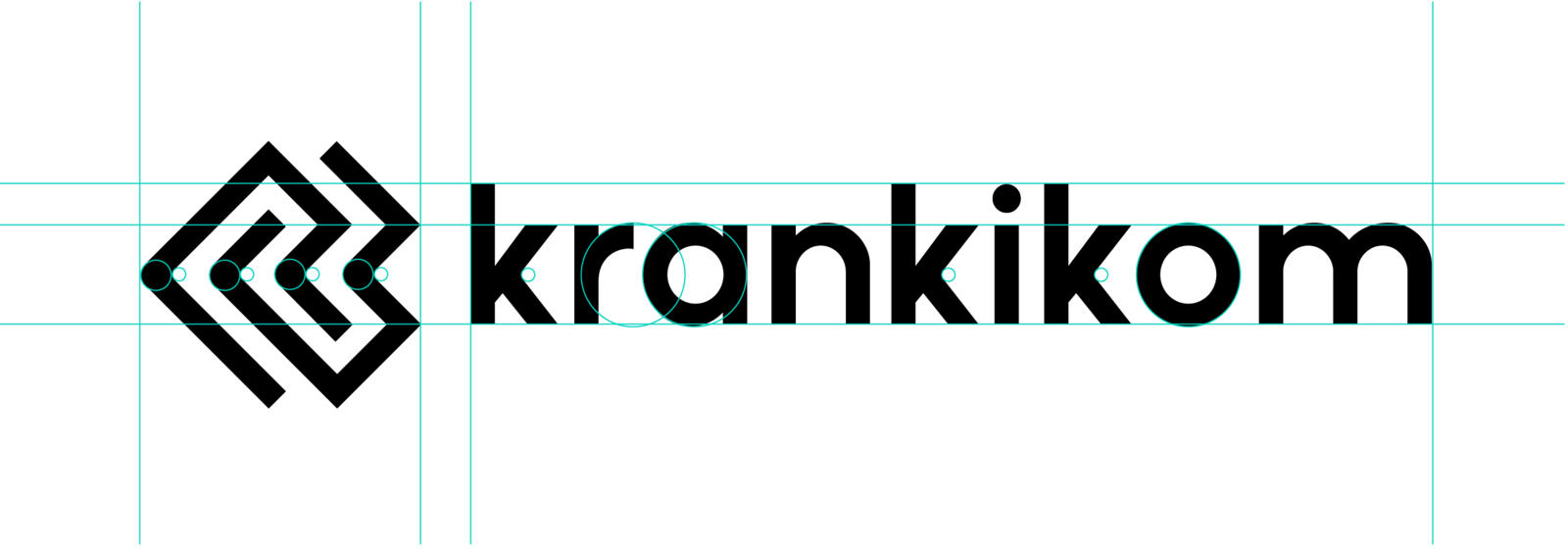
Our logo is founded on simple shades and meticulously adjusted to maintain a distinctive appearance that exudes a techy vibe while also retaining human characteristics (after all, who's truly flawless?). The wordmark is crafted using the geometric font POLLY, with subtle modifications in terms of corners, height, and kerning.
The two arrows, which previously symbolized Krankikom, underwent a redesign in 2019, resulting in a fresh, modern aesthetic. While still representing the two "K"s from Krankikom, these two lines now embody a contemporary, minimalist, and timeless essence. To infuse a touch of human warmth and soften the sharp, technical edges, we've rounded the corners of the middle line, carrying this aesthetic over to the "K"s of Krankikom.
Clearspace
Clear space is essential to safeguard our logo and provide it with room to breathe. After all, we wouldn't want things to feel cramped, would we? The clear space surrounding the logo, measured from the height of the figurative mark, is equivalent to the cap height of the letter "k".
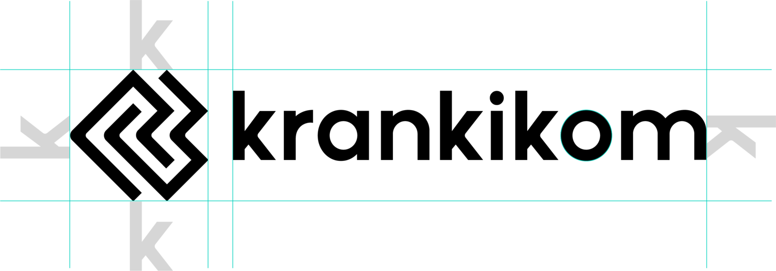
Nevertheless, the clear space may fluctuate based on the type of communication and its intended use. It's important to note that deviating from the standard clear space requires seeking permission.
Color
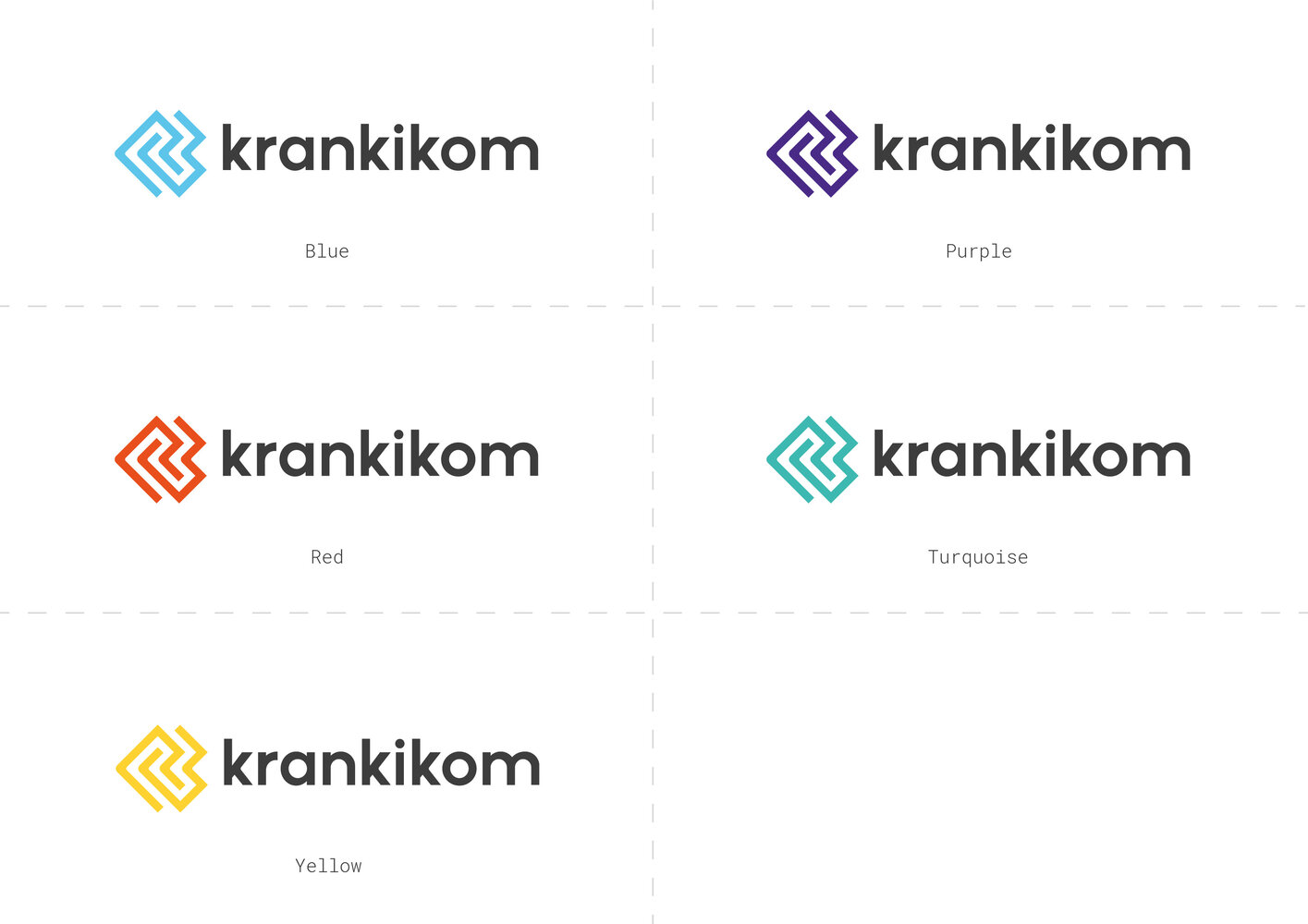
The primary color of our logo is a deep gray, while the figurative mark has the flexibility to shift its tone to any of our five primary colors, emphasizing our diversity. Feel free to select any of the provided colors according to your personal preference or mood, as they aren't tied to a specific service field or theme.
These logos are designed for a wide range of use cases, including website navigation, footers, presentations, and more. Additionally, we possess a full-color version of our logo that comes into play when dealing with materials that allow for a touch of artistic flair. Take a look and explore!
Avoid Black and White
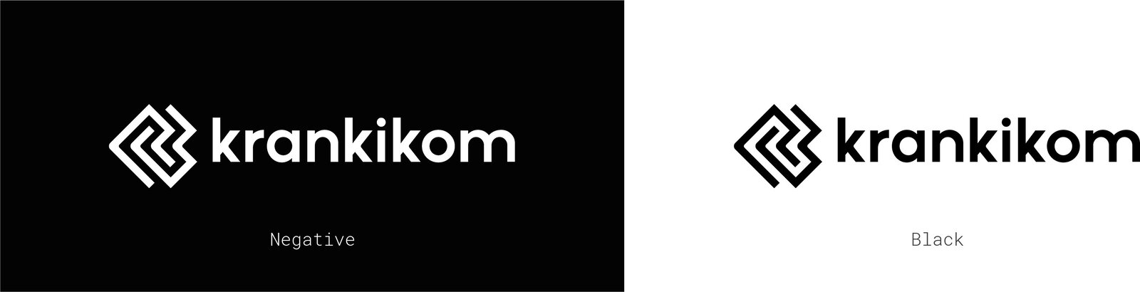
Let's refrain from utilizing the logo in just black or white. While we do employ the black version of the logo in this style guide to accentuate specific elements, our aim is to celebrate our diversity by incorporating various colors throughout.
Go full color!
There are moments in life when a burst of color is exactly what's needed!
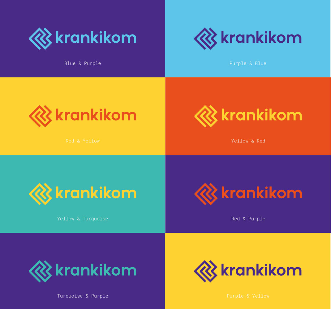
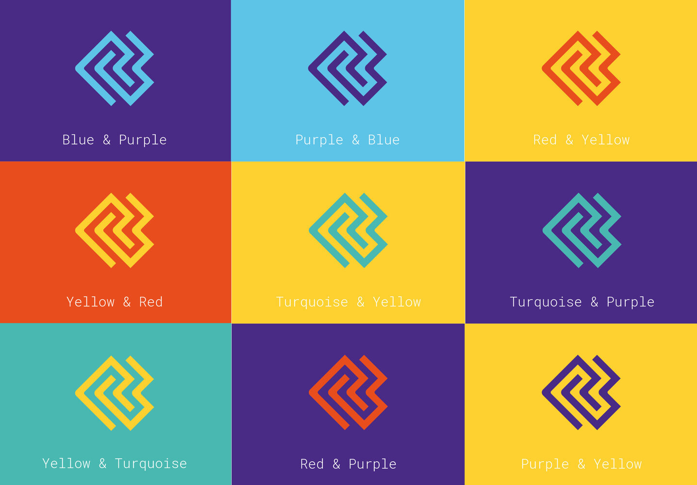
At Krankikom, we experience times of subtlety, as well as moments when we want to make a bold statement to the world. For those instances, we've crafted a version of our logo in a vibrant, full-color theme.
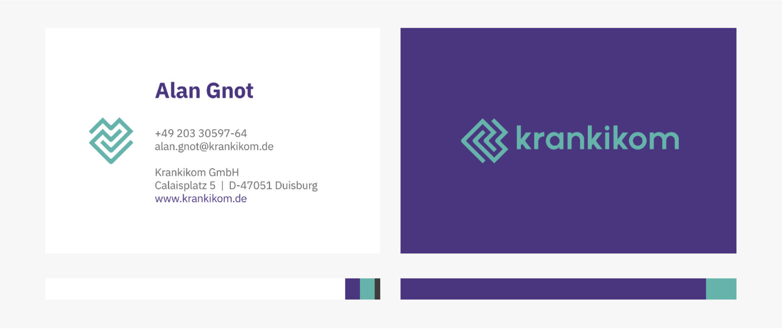
It's important to note that these particular logos are designated for specific decorative use and should exclusively be placed on colorful backgrounds. They find their perfect home, for instance, on our business cards, where they vividly convey our affection for lively shades. Moreover, don't hesitate to unleash your creativity with these logos, perhaps by designing an eye-catching poster.
If ever uncertain about which logo variation is most appropriate, feel free to reach out to the Krankikom the Krankikom design team. We will help you out asap!
Guidance
Downloads
Logo (Figurative)
Be bold and colorful! Spread your uniqueness!
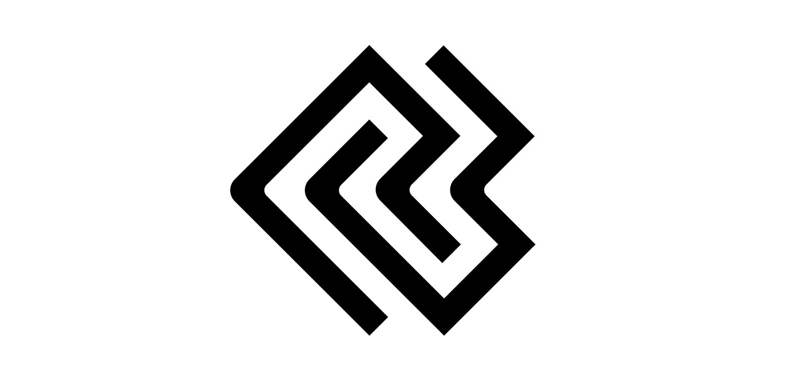
The figurative mark is designed to be abstract, modern and minimalistic. We want the viewer to let his/her imagine flow and see whatever he/she likes to see in our mark. It can be a maze, a river, a brain or just the two arrows that it actually is.
Its origin lies in our two arrows which almost every of our older Logos had. Our history is important to us and we want to stick to our roots no matter how our work or our surrounding changes.
Construction
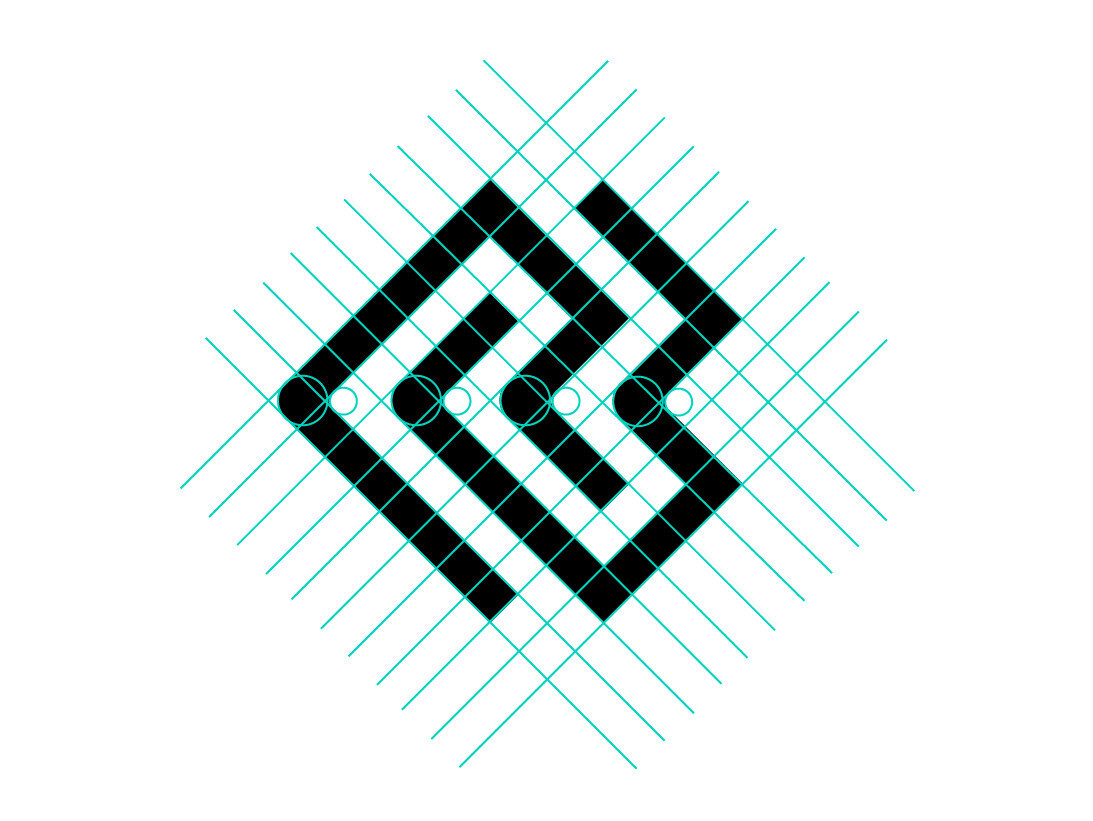
To fit the modern and clean style the mark is based on clear geometrical shapes which underlines our technical character. To make it more human and perfectly unperfect we rounded the corners on the middle line which make the logo appear more warm and charming (what we actually are, here at Krankikom ;) )
Clearspace
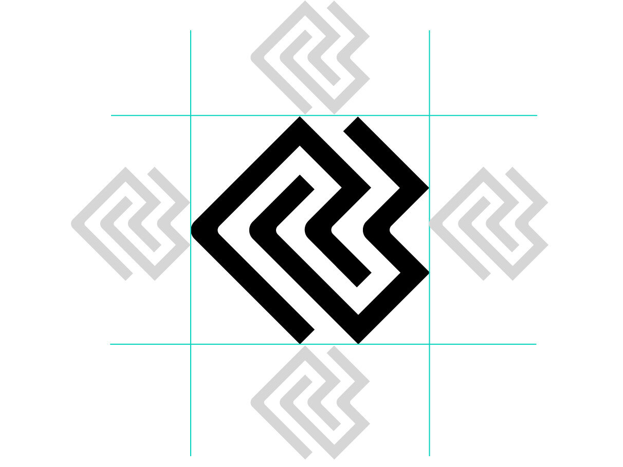
The Clearspace around the Logo is equal to half of the figurative mark's height.
Clearspace exceptions
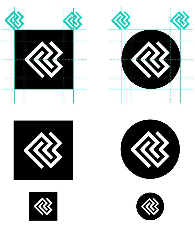
Logo placement and clear space requirements are contingent upon the specific communication context and purpose. For instance, when used as an avatar or social icon, the logo is centered both vertically and horizontally within the icon shape. In this case, allocate half of the designated clear space for the figurative mark, creating padding to the left and right edges of the icon shape.
Colour
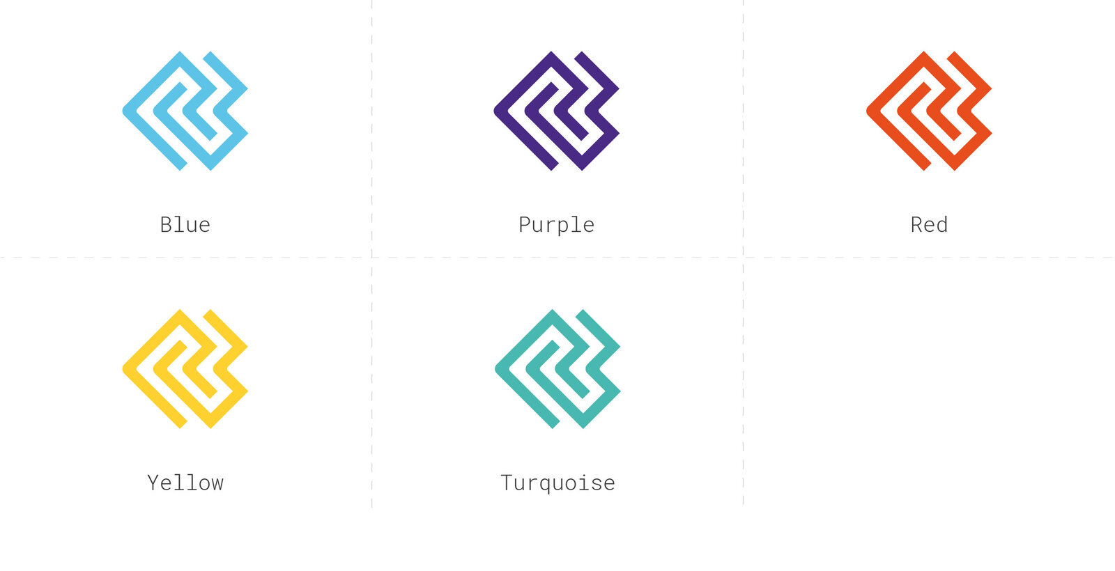
The figurative mark is accessible in our five primary colors, as well as black and white. Nonetheless, we encourage minimizing the use of the black and white version and resorting to it only when absolutely required. Our aim is to celebrate our diversity through our distinctive colors, reflecting the uniqueness inherent in each of us.
Usage
The figurative mark is suitable for use on materials where it's evident to the viewer that Krankikom is the source. This encompasses primarily internal documents, posters, and avatar icons on various social media platforms. Furthermore, it can also serve as an additional decorative element alongside the word/figurative mark.
However, a crucial consideration is ensuring that the viewer readily recognizes Krankikom as the originator of this mark. Given that we might not be as widely recognized as industry giants like Nike or Apple, in most situations, it's advisable to utilize the complete logo (comprising both the word and figurative mark) to establish a strong association.
Guidance
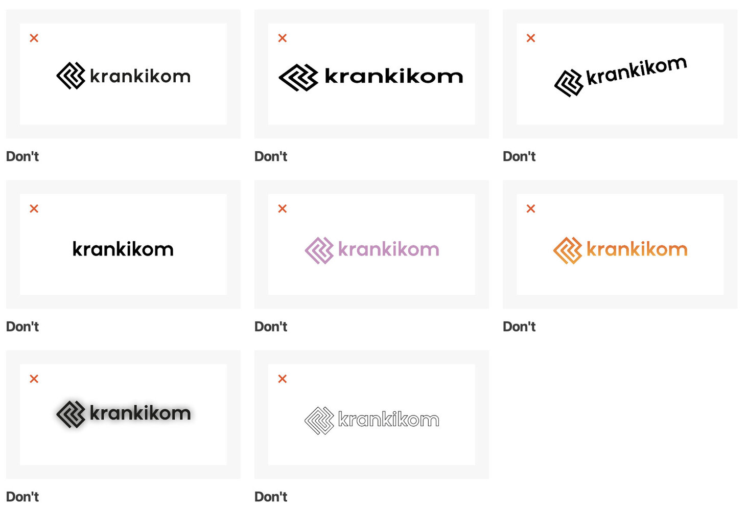
The guidelines for proper usage and limitations can be located on the dedicated page for the word/figurative mark.
The Heart
Among the guidelines, there is a rule stating that the logo should not be rotated. However, there exists a single exception to this rule.
The figurative mark extends an invitation to perceive whatever resonates with you. Interestingly, our personal favorite interpretation involves flipping the mark to reveal an abstract heart shape. This exceptional case allows for a departure from the standard rule about logo rotation.
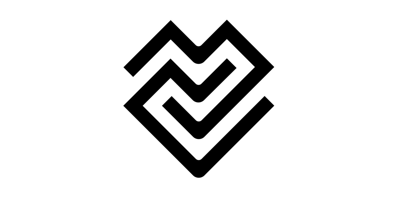
The heart symbol carries profound significance at Krankikom, embodying numerous aspects of our identity. It reflects our foundation and leadership driven by heartfelt dedication. It underscores the passion with which we approach our work. It encapsulates the warmth of the partnerships we cultivate with our clients. Moreover, for many among us, it symbolizes the formation of friendships and even the discovery of love within our office walls. The heart, in essence, stands as a multifaceted emblem that resonates deeply with us, making it one of our most cherished symbols.
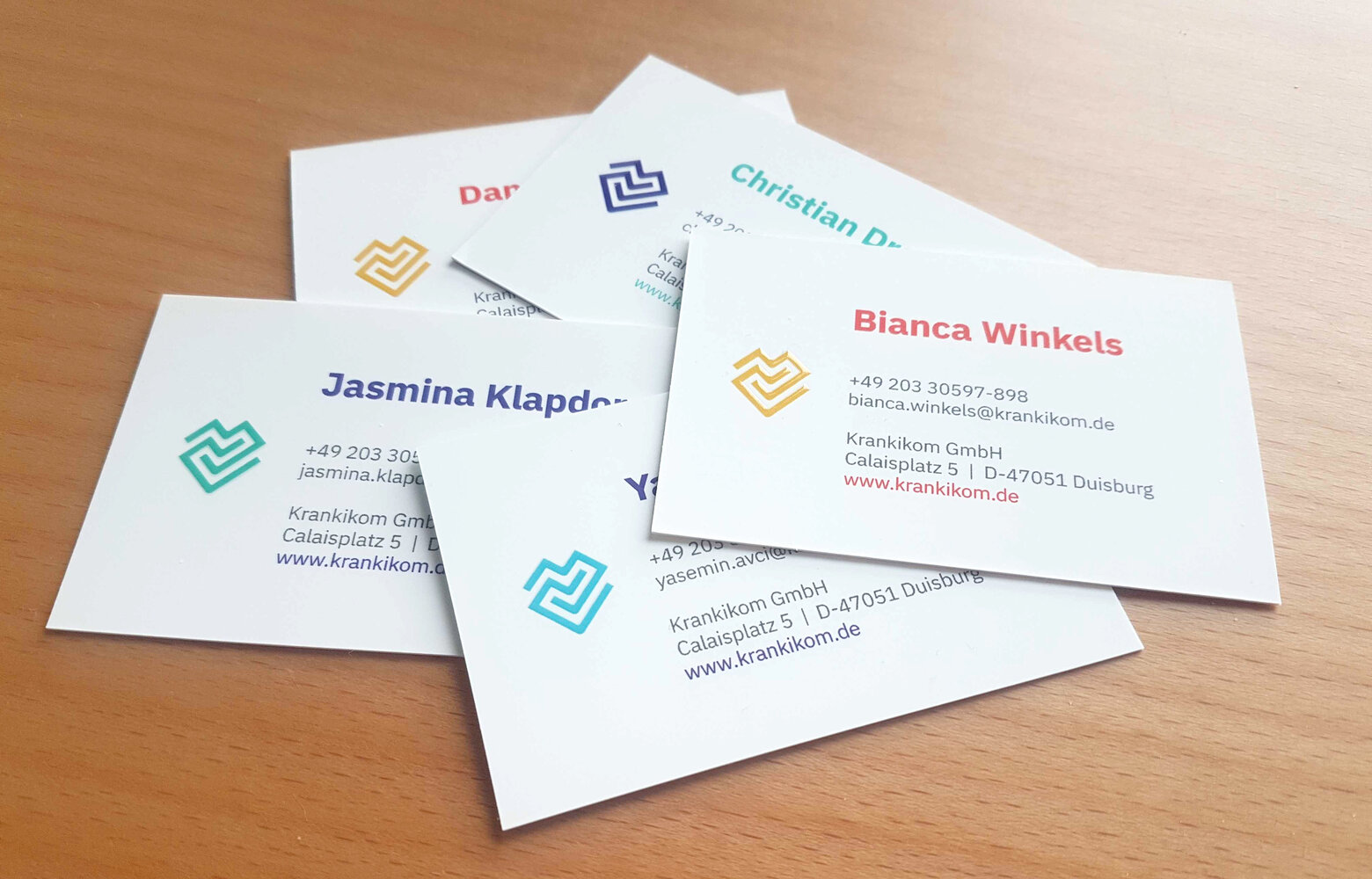
This emblematic heart can be employed as a decorative element and seamlessly integrated alongside our primary logo (the word/figurative mark). We've incorporated it, for instance, into our business cards. These cards serve as a representation of us and by including the heart, we symbolically share a piece of our heartfelt commitment with our clients.
Feel free to explore and utilize this symbol in various ways, aligning it with our ethos and values.
Primary Colors
Our secondary colors are more neutral and support our primary colors.
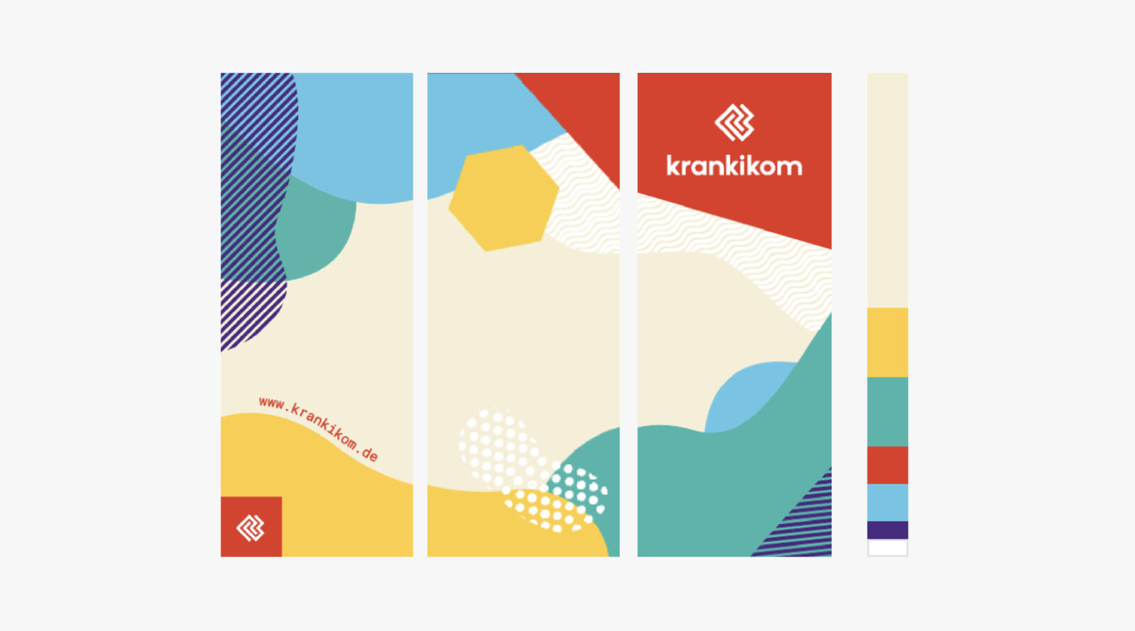
Our colors vividly echo one of our fundamental values that we hold dear: diversity! In line with this, we've opted not for one or two primary colors, but a palette of five. These shades are in harmonious equilibrium, much like our ethos.
The selection of these colors was deliberate, chosen to be bold, vibrant, and uniquely characteristic to mirror our identity. They're not just a means of reflecting our essence, but also serve to ensure accessibility and maintain a cohesive thread across all our brand communications.
Our Primary Brand Colors
Purple
HEX
#4b238c
RGB
75 35 140
CMYK
90 100 0 0
Pantone
267C
Turquoise
HEX
#00d2be
RGB
0 210 190
CMYK
70 0 40 0
Pantone
3262C
Red
HEX
#ff4b00
RGB
255 75 0
CMYK
0 90 100 0
Pantone
172C
Yellow
HEX
#ffd22d
RGB
255 210 45
CMYK
0 20 90 0
Pantone
116C
Blue
HEX
#5ac8eb
RGB
90 200 235
CMYK
65 0 10 0
Pantone
298C
Our primary colors are intentionally unattached to any specific field or theme, providing us the freedom to choose from our diverse palette of five. This inclusivity extends to our logo design, where any of these five colors can be seamlessly integrated.
Crucially, in designing comprehensive pieces of work like website sections, flyers, posters, business cards, and more, the use of multiple colors is paramount. This practice serves to avert the misconception that a solitary color is emblematic of a particular subject. By employing at least two colors, we affirm our commitment to representing the broad spectrum of our identity without undue associations.
Usage
We uphold a flexible set of guidelines that encourage creative exploration and experimentation with our Corporate Design, while upholding the tenets of brand consistency and universal accessibility.
When communicating directly with our clients, white serves as a pivotal component of our brand's communication. Given our diverse clientele from various fields, we aim to appeal to each distinct individual. White acts as a blank canvas, enabling us to infuse our primary colors as mood accents, resonating with different clients.
For indirect communication like posters, gifts, and business cards, we're afforded greater expressive latitude. Here, the utilization of our primary colors can be more pronounced, and we're even at liberty to mix and match hues. However, it's essential to ensure that the contrast ratio is maintained to ensure inclusivity, rather than exclusivity.
In essence, our objective is to create an inviting atmosphere that welcomes all, embodying both creative liberty and the spirit of inclusivity.
Examples
Business Card
Pixlip Wall
Secondary Colors
With our choice of fonts we want to express who we are
Our Secondary Brand Colors
Black
HEX
#000000
RGB
0 0 0
CMYK
0 0 0 100
Pantone
-
Dark Grey
HEX
#3c3c3c
RGB
60 60 60
CMYK
0 0 0 90
Pantone
447C
Light Grey
HEX
#ebebeb
RGB
235 235 235
CMYK
0 0 0 10
Pantone
5315C
White
HEX
#ffffff
RGB
255 255 255
CMYK
0 0 0 0
Pantone
-
Beige
HEX
#faf0dc
RGB
250 240 220
CMYK
0 5 20 0
Pantone
7506C
Usage
Our Secondary Brand colors are strategically employed to enhance and underscore the impact of our primary colors. Specifically, the Black and Dark Grey shades find their primary application in text, ensuring clarity and legibility. On the other hand, the lighter shades among our secondary colors are predominantly utilized as background colors. This composition ensures an effective interplay between foreground and background elements, contributing to a balanced and visually appealing design.
Typography
With our choice of fonts we want to express who we are
Overview
Our Typography underlines our characteristics and support what we want to communicate: we hare human beings who work with passion in a (on the first look) unhuman industry - the digital tech industry. Therefor we chose to work with two typefaces.
IBM Plex Sans
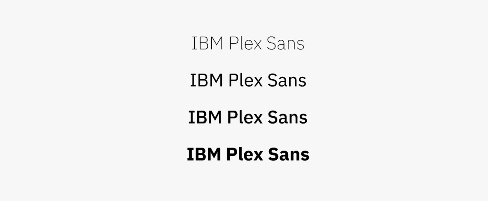
IBM Plex Sans stands as our cornerstone typeface, serving as a pivotal element in our brand identity. This modern, yet enduring font possesses a global and versatile character. Its design strikes a harmonious equilibrium between humanistic and rational attributes, effectively conveying our personal touch. The typeface's distinctive trait lies in its balance of the grotesque style, which deviates from the perfectly rounded forms. Numerous subtle micro adjustments lend it a unique and approachable demeanor.
For a more comprehensive understanding of the origins and intricacies of IBM Plex, we invite you to delve into the full story behind this remarkable typeface.
Digitalkontor
Home sweet home!
Overview
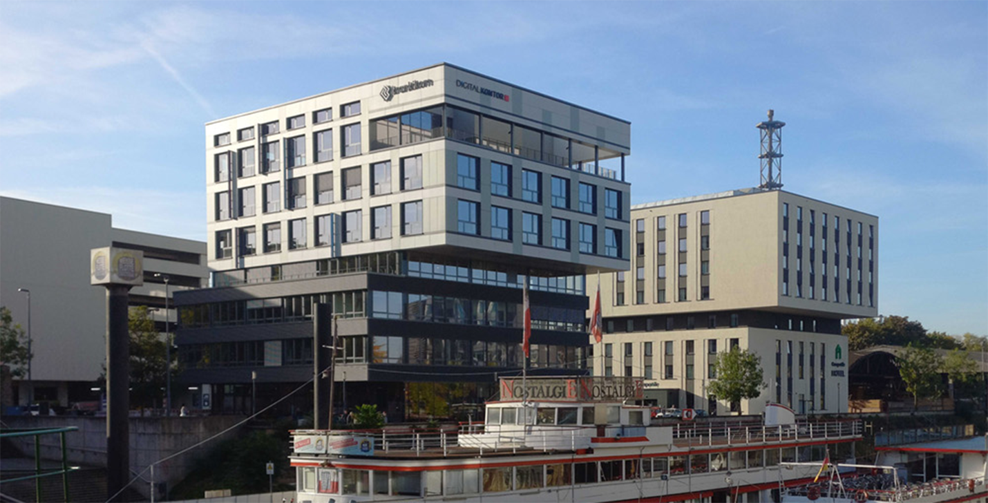
Digitalkontor is our Home! Therefore, its corporate identity holds great significance for us. We aim to document its assets along with its color scheme.
Colors
Digitalkontor Red
HEX
#fc3d3a
RGB
252 61 58
CMYK
0 76 77 1
Pantone
Warm Red C
RAL
RAL3003 - Ruby Red
Medium Grey
HEX
#909090
RGB
144 144 144
CMYK
0 13 13 47
Pantone
877 C
RAL
RAL7045 - TeleGray 1
Dark Grey
HEX
#474a51
RGB
71 74 81
CMYK
13 9 0 69
Pantone
7540 C
RAL
RAL7024 - Graphite Gray
